Design that speaks louder than words, where visuals meet vision.
Turning ideas into visuals that leave a lasting impression.
Modern. Bold. Thoughtful. Design built to move people.
All images were created by ViewMyVizion
AURASTREAM
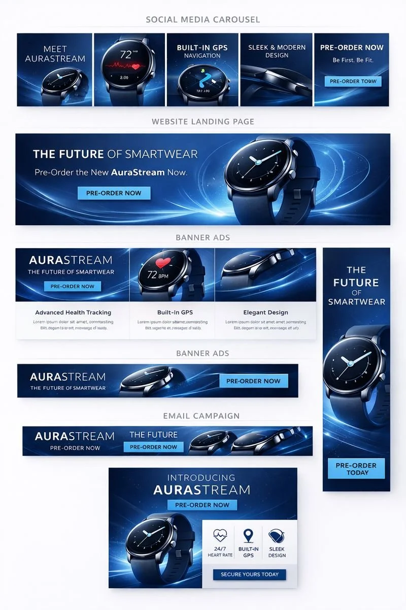
The objective is to launch the new AuraStream smartwatch through a visually striking digital campaign that builds anticipation, communicates key features, and drives pre-orders. The creative direction emphasizes innovation, clarity, and performance through sleek, minimalist design.
Visual Design
Look and Feel
Clean, modern, and technology-forward
Cool blue color palette with subtle gradients
Minimalist geometric shapes inspired by data flow and motion
High-contrast typography with generous white space
Emphasis on product detail and premium materials
Design Language
Thin line icons and UI-inspired elements
Soft glows and motion blur to suggest real-time data tracking
Consistent grid systems and alignment for clarity and polish
Overall Tone
The campaign feels confident, forward-thinking, and premium. Every asset reinforces AuraStream as a modern wearable brand that blends performance, design, and innovation without visual clutter.
Brand Mood board Description
AuraStream embodies precision, innovation, and modern restraint. The visual identity is rooted in minimalism, with an emphasis on clarity, performance, and forward-thinking technology. The brand feels confident and refined, designed for users who value both functionality and aesthetics.
The color palette is anchored in cool blues and deep navy tones, evoking trust, intelligence, and advanced technology. Subtle gradients and soft light effects suggest movement, data flow, and real-time performance, while darker backgrounds allow the product to feel premium and elevated.
Typography is clean and contemporary, favoring sans-serif typefaces with balanced proportions and generous spacing. Headlines feel bold yet restrained, while supporting text remains legible and purposeful. The overall type system supports clarity without distraction.
Imagery focuses on close-up product shots and polished lifestyle moments. The smartwatch is presented as the hero, often isolated against minimal backgrounds or paired with abstract, geometric forms inspired by UI elements, motion paths, and data visualization. Lighting is crisp and controlled, highlighting materials and craftsmanship.
Graphic elements are subtle and intentional. Thin lines, soft glows, and geometric shapes reference technology and connectivity without overwhelming the composition. Layouts are grid-driven, spacious, and highly structured, reinforcing a sense of order and precision.
Overall, the AuraStream moodboard reflects a brand that is modern, intelligent, and quietly powerful. It communicates innovation through simplicity, positioning AuraStream as a wearable designed for the future, not trends.